The humble primitive
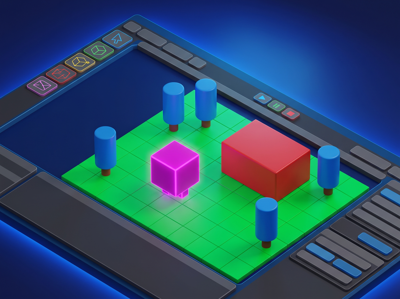
Every 3D game starts with default primitives — the cubes, spheres, capsules, and planes that come built into every engine. Most developers see them as a temporary stepping stone on the way to "real" art. But they don't have to be.
When used consistently and deliberately, simple geometric shapes can form a complete visual identity. Games like Thomas Was Alone, Q.U.B.E., and 140 prove that minimal 3D geometry can carry an entire game's art direction.
Why primitive art works
Simple geometry has several advantages that make it surprisingly effective:
- Instant readability. Players instantly recognize what everything is and can focus on gameplay.
- Performance. Low-poly scenes run on everything and leave plenty of headroom for effects and logic.
- Style consistency. It's impossible to have inconsistent models when you only use five shapes.
- Focus on design. Without detailed art to hide behind, your game design has to stand on its own merits.
- Iteration speed. Modifying a primitive-based level is orders of magnitude faster than a detailed one.
The shape vocabulary
You only need a small set of basic shapes to build almost anything. Here's the core vocabulary:
| Shape | Best for | Associations |
|---|---|---|
| Cube | Buildings, walls, platforms, boxes, furniture | Stability, structure, man-made |
| Sphere | Characters, projectiles, orbs, planets | Softness, organic, energy |
| Capsule | Humanoids, trees, columns, barrels | Elegant, simple characters |
| Cylinder | Pipes, towers, wheels, columns | Industrial, structural |
| Plane | Floors, walls, backgrounds, surfaces | Flat, expansive |
| Torus | Rings, portals, wheels, energy fields | Energy, magic, technology |
Building objects from primitives
You'd be surprised how much you can build by combining just a few shapes. The technique is sometimes called "kitbashing" or "primitive assembly," and professional concept artists use it too — it's not just for placeholders.
Here are some common combinations:
- A tree: cylinder (trunk) + sphere (canopy) — instantly readable as a tree
- A house: cube (body) + rotated cube (roof) + small cylinder (chimney)
- A car: box (body) + 4 cylinders (wheels) + smaller box (cabin)
- A humanoid: capsule (body) + sphere (head) + small capsules (limbs)
- A tower: tall cylinder + cylinder cap + small sphere on top
- A weapon: long cube (barrel) + smaller cube (body) + thin cylinder (grip)
The trick is to use proportions and color to differentiate objects. Two objects made from the same shapes can look completely different if one is tall and narrow and the other is short and wide.
To see if your primitive-based design works, squint at the screen or step back from your monitor. If you can still tell what everything is, the shape language is working. If things blur together, you need more differentiation in shape, color, or size.
Color and materials
With simple geometry, color does most of the heavy lifting for visual identity. Since there's no texture detail to look at, the color of each object is its most important visual characteristic.
Approach material design systematically:
-
1
Assign categories
Decide which categories of objects exist in your game: player, enemies, collectibles, hazards, environment, etc.
-
2
Pick a color per category
One dominant color per type. Make them distinct from each other and from the background.
-
3
Create shade variations
2-3 shades per category for objects that are slightly different but still the same type.
-
4
Stick to one material type
Either unlit/flat or simple lit. Mixing material types breaks visual cohesion.
Lighting and atmosphere
Lighting is where primitive-based scenes go from "placeholder" to "stylized." Good lighting can make even the simplest geometry look deliberate and beautiful.
- Directional key light. One main light source at an angle. Avoid flat, uniform lighting — it makes everything look like a greybox.
- Fog. Distance fog is the single most effective trick for simple 3D scenes. It hides the edges of the world, adds depth, and creates atmosphere.
- Color grading. Tint the whole scene toward a particular mood — cool blues for sci-fi, warm oranges for fantasy, muted grays for melancholy.
- Emissive objects. Make important things glow. It draws the eye and looks good with simple geometry.
- Shadows. Even simple shadow maps add a huge amount of depth. Use soft shadows for a polished look, hard shadows for a retro feel.
Outlines and wireframes
Adding an outline to every object is one of the fastest ways to make a primitive-based scene look intentionally designed rather than unfinished. Outline shaders — sometimes called "toon shaders" or "cel shaders" — define the edges of each object with a clean line.
You have several options:
- Inverted hull method. The classic approach — duplicate the mesh, scale it slightly, flip the normals, and render it in a dark color behind the original.
- Post-processing outline. An edge-detection pass on the final image. Fast and easy, but less control.
- Wireframe. Showing the wireframe of every object is a bold look that screams "tech demo" or "debug aesthetic." Can be very effective if done consistently.
- Fresnel rim lighting. Not technically an outline, but the effect is similar — a bright glow around the edges of objects.
Motion and feedback
One of the biggest advantages of simple geometry is that you can animate everything cheaply. Motion adds personality to objects that would otherwise just be inert shapes.
- Idle animation. Even a gentle bob or slow rotation makes objects feel alive.
- Hit reaction. Scale flash, color flash, or knockback when objects get hit — extremely effective feedback.
- Squash and stretch. The classic animation principle works great with simple shapes. Squash a cube on impact, stretch it when it jumps.
- Particle trails. A simple trail of basic particles makes any moving object look better.
- Camera shake. Cheap, overused by some, but undeniably effective for adding impact to actions.
When you might need more detail
Primitive art isn't the right choice for every game. Consider upgrading your art if:
- Players can't tell objects apart even with distinct colors and sizes
- Your game relies on detailed character expression or emotion
- The setting needs specific recognizable objects (real-world locations, specific vehicles)
- You're targeting a market segment that expects polished visuals
- The art is actively turning players away (check your analytics and feedback)
If none of these apply, you can probably ship a successful game with primitive-based art. The quality of your game design matters far more than whether your models are detailed.